Tutorial: How to Edit a WordPress Page
Step 1: Log into Your WordPress Dashboard
To get started, you need to log into your WordPress admin dashboard:
Open your web browser and navigate to your website’s admin login page (e.g., https://brainsparklearningcenter.org/).
Enter your username and password, then click Log In.
Once logged in, you’ll be directed to the Dashboard, where you can manage all aspects of your website.
Step 2: Editing the Header in Elementor
To edit a header in Elementor, follow these steps:
Click on the Header: Navigate to the page where the header is located. Click directly on the header you want to edit.
Access the Editing Box: Once you click the header, you’ll see the editing panel appear on the left side of the screen. This panel will display options to adjust the header's content, styling, and layout.
Step 3: Styling the Header
- To style the header in Elementor, follow these steps:
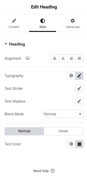
Select the Style Tab: In the left-hand panel, click on the Style tab to access the styling options for your header.
Alignment:
Under the Alignment section, choose how you want the header content to be aligned. You can align the text to the left, center, or right of the header area, depending on your design preference.
Typography:
The Typography settings allow you to adjust the font, font size, weight, style, line height, and letter spacing. Choose a font that matches your brand style, and ensure the text is readable and well-spaced for better user experience.
Text Stroke:
The Text Stroke setting (if available) allows you to add an outline around the text. You can control the stroke's color and width to create a bold effect around your text, making it stand out more.
Text Shadow:
To add depth to your text, use the Text Shadow option. You can adjust the shadow's color, blur, and position to create a subtle shadow effect that enhances the text visibility, especially on busy backgrounds.
Text Color:
In the Text Color section, choose the default color for your header text. Select a color that complements the design and is easy to read.
Hover Text Color:
The Hover option allows you to change the color of the text when the user hovers over it with their mouse. This is useful for interactive elements like buttons or links in the header. You can set a different color for when the cursor is over the text to create an engaging visual effect.
Preview Your Changes: As you adjust these settings, you’ll see the changes in real-time on the page. This allows you to fine-tune your header’s appearance and make sure it aligns with your design goals.
Preview Your Changes: As you make adjustments, you’ll see the changes applied in real-time on the page.
Step 4: Advanced Settings for the Header
To fine-tune the header further, Elementor provides Advanced settings that allow you to add custom effects and more precise control over the header's behavior and positioning:
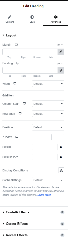
Padding and Margin:
Under the Advanced tab, you can adjust the Padding and Margin to control the spacing around the header. Padding affects the internal space inside the header, while margin controls the space outside the header. Adjust these settings to ensure the header has the right balance of space and fits the design perfectly.
Z-Index:
The Z-Index determines the stacking order of elements. If you have elements overlapping on the page, increasing the Z-Index of the header ensures it stays on top. Set a higher Z-Index if you want the header to appear above other elements on the page.
Custom Positioning:
Elementor also allows you to control the position of the header using Positioning options. You can make the header fixed (stays at the top when scrolling), absolute, or relative. This is useful if you want the header to stay visible as users scroll down the page.
CSS Classes and ID:
If you're comfortable with custom CSS, you can add a CSS Class or ID to the header. This allows you to target the header specifically with custom CSS for advanced styling or behavior.
Custom CSS:
If you need more control over the design, Elementor allows you to add custom CSS directly to the header. This is perfect for unique visual effects or advanced modifications that go beyond what the panel options provide.
Motion Effects (Optional):
If you're looking for animations, you can add Motion Effects under the Advanced tab. These include scrolling effects like fade-in, zoom, or slide effects that trigger when users scroll the page. Motion effects help make the header more interactive and engaging.
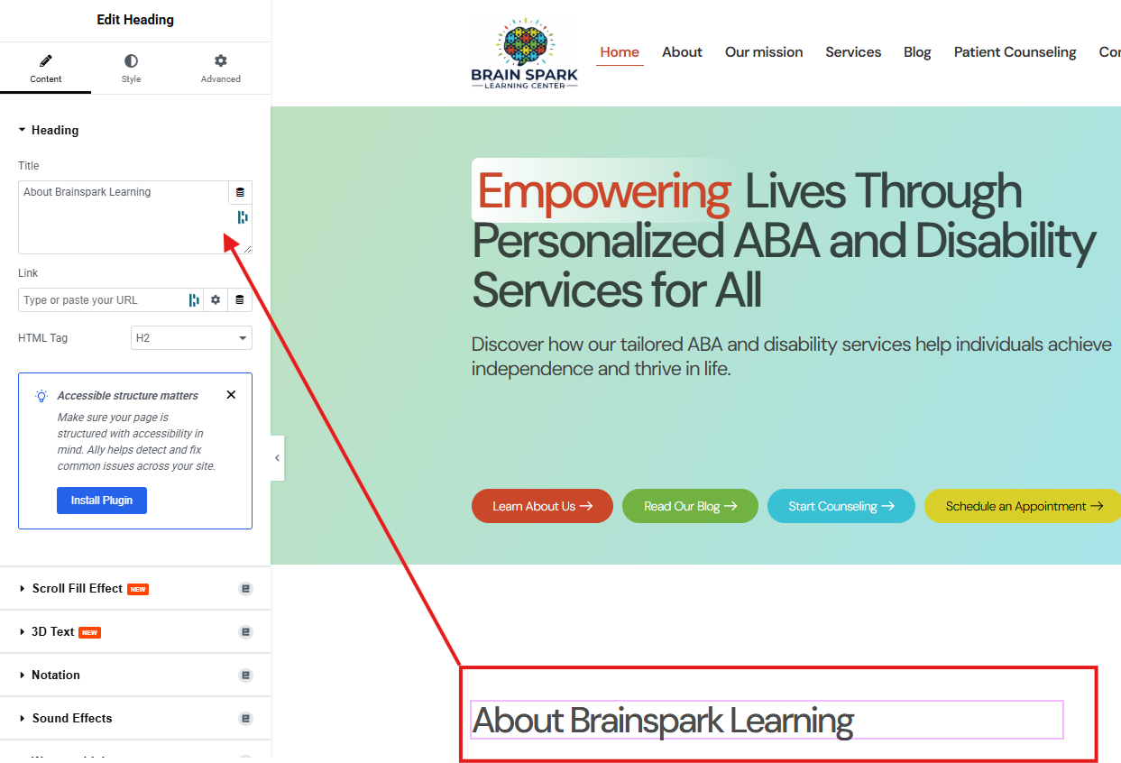
Step 5: Editing and Styling the Text Editor Widget
The Text Editor is where you’ll manage and format your body content.
Select the Widget: Click on the Text Editor widget you want to modify. The editing panel will appear on the left.
Content Tab: This is where you write and format your text.
Edit Text: Type or paste your content. You can also edit it directly on the page by double-clicking.
Formatting Toolbar: Use the toolbar to apply basic formatting like bold, italic, bullet points, and numbered lists.

Step 6: Editing Buttons
Elementor's Button widget is key for guiding visitors to the right actions on your site. The screenshot you provided shows how the two main parts of the button connect to the editing panel.
The green arrow points from the button's text to the Text field in the panel. This is where you type in the text you want the button to display, like "Learn About Us."
The red arrow points from the button's appearance on the page to the Link field in the panel. This is where you paste the URL of the page you want the button to send visitors to.
Step 7: Styling the Button
Once you've set the content and link, use the Style tab to customize the button's look. This includes:
Typography: Adjust the font and size of the button's text.
Background Type: Change the button's color or add a gradient.
Border Type: Give the button a border and adjust its thickness and color.
Border Radius: Make the corners of the button rounded.
You can also set a different style for when someone hovers over the button to create a cool, interactive effect.
Step 8: Advanced Button Settings
The Advanced tab offers the same powerful controls as other widgets. You can fine-tune the button's position, add spacing, and even apply motion effects to make it stand out.
Remember to click the green Update button to save your changes.

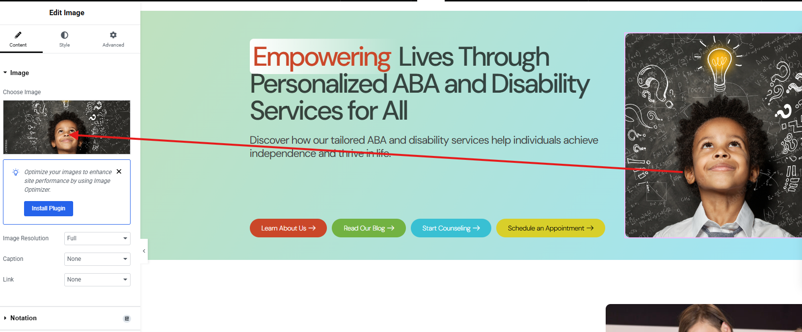
Step 9: Editing Images
The Image widget in Elementor allows you to add and customize images on your page. Here's how to manage them:
Select the Image Widget: Click on the image you wish to edit. The editing panel will appear on the left, showing the image's settings.
Content Tab: This tab is for managing the image source and basic linking.
Choose Image: Click on the image preview or the "Choose Image" button to open your Media Library. From here, you can select an existing image or upload a new one from your computer.
Image Size: Select a size for your image (e.g., thumbnail, medium, large, full). Choosing an appropriate size can help optimize your page loading speed.
Caption: Add a caption that will display with your image.
Link: You can link the image to a custom URL, a larger version of itself (media file), or a custom lightbox when clicked.
Step 10: Styling Images
The Style tab provides extensive options for visually enhancing your images:
Width & Height: Precisely control the dimensions of your image.
Opacity: Adjust the transparency of the image.
CSS Filters: Apply various visual filters like blur, brightness, contrast, saturation, and hue to create unique effects.
Border Type: Add a border around your image, customizing its style, width, and color.
Border Radius: Round the corners of your image.
Box Shadow: Add a shadow effect to give your image depth and make it stand out.
Step 11: Advanced Image Settings
The Advanced tab offers the standard Elementor controls for layout, motion, and custom attributes, allowing for precise placement and dynamic effects:
Layout: Fine-tune spacing with Padding and Margin. Control how the image interacts with other elements using Z-Index and Custom Positioning.
Motion Effects: Add animations like fade-ins, zooms, or other scrolling effects to make your images more engaging.
Custom Attributes: For advanced users, add custom HTML attributes to the image for specific functionalities.
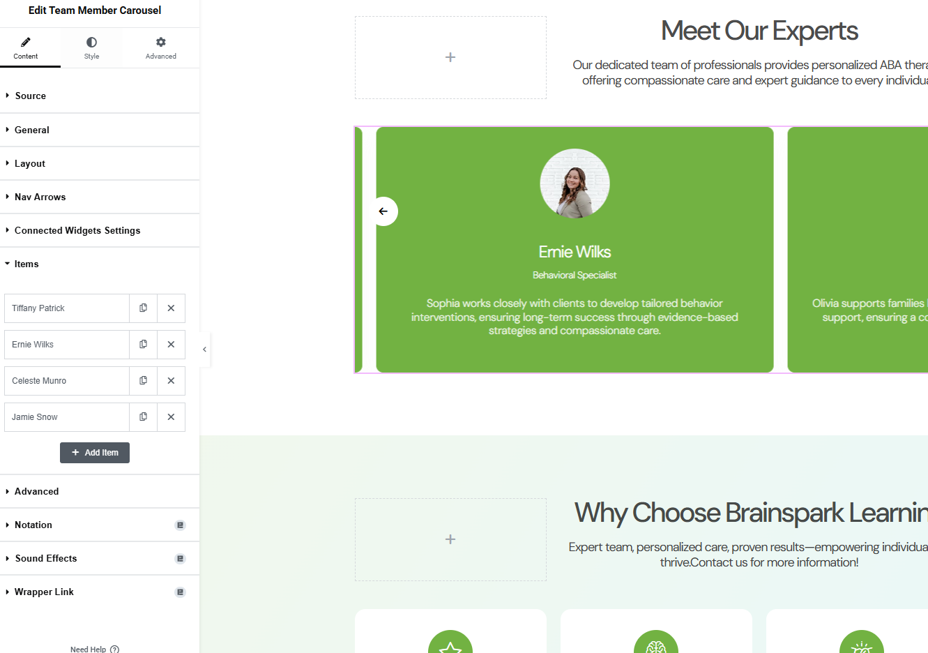
Step 12: Editing the Team Member Carousel
The Team Member Carousel widget is a great way to showcase your team in a clean, professional slider.
Content Tab: This tab is where you manage each team member's information.
Items: In this section, you'll see a list of each team member. You can click on a person's name to edit their specific details, including their name, title, and a short bio.
Add Item: To add a new team member, simply click the "+ Add Item" button at the bottom of the list.
Style Tab: The Style tab works just like the other widgets, allowing you to customize the look of the carousel itself, including the background colors, text fonts, and spacing.
Advanced Tab: You can use the Advanced tab to fine-tune the layout and add motion effects to the carousel.
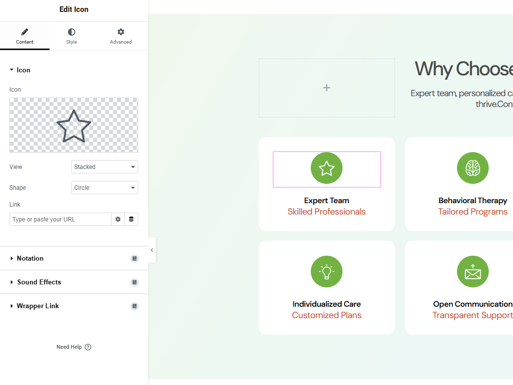
Step 13: Editing Icons
Icons are a great way to add visual appeal and clarity to your website. Here’s how to edit them using the Icon widget in Elementor:
Select the Icon Widget: Click on the icon on your page that you want to change. This will open the editing panel on the left side of the screen.
Content Tab: This is where you will find the main options for your icon.
Icon: Click the icon preview to open the Elementor icon library. You can choose from hundreds of icons or upload your own SVG file.
View: This option changes how the icon is displayed.
Default: Shows just the icon itself.
Stacked: Places the icon on a solid-colored background.
Framed: Places the icon with a colored border around it.
Shape: If you've chosen "Stacked" or "Framed," you can select the shape of the background to be either a Circle or a Square.
Link: You can make the icon clickable by entering a URL here. When a visitor clicks on the icon, they will be taken to that link.
Style Tab: The Style tab is where you customize the icon's colors, size, and spacing.
You can change the main icon color and the background color (if you chose "Stacked" or "Framed").
You can also adjust the icon's size, rotation, and spacing.
Advanced Tab: As with other widgets, the Advanced tab allows you to fine-tune the icon's layout on the page using settings like Margin, Padding, and Motion Effects.
Step 15: Editing Toggles
The Toggle widget is used to create collapsible sections of content, often for FAQs or other information you want to hide initially.
Select the Toggle Widget: Click on the toggle you want to edit. The editing panel will open on the left.
Content Tab: This is where you manage the individual toggle items.
Toggle Items: Click on any item to expand its settings. Here you can edit the Title and add or change the content inside the toggle.
Add Item: To add a new collapsible section, click the "+ Add Item" button. This will create a new toggle you can fill with a title and content.
Icons: You can also set a different icon for when the toggle is open (Active Icon) versus when it's closed.
Step 16: Styling Toggles
As with other widgets, the Style tab gives you full control over the visual appearance of your toggles.
Toggle: Adjust the spacing, border, and colors for the entire toggle container.
Title: Style the font, color, and background of the toggle's title. You can also set a different color for the active (open) state.
Icon: Change the color, size, and alignment of the expand/collapse icon.
Content: Style the text inside the toggle when it's open, including typography and background color.
Step 17: Advanced Toggle Settings
Use the Advanced tab for precise layout control. Here you can adjust padding, margin, and add motion effects to your toggles.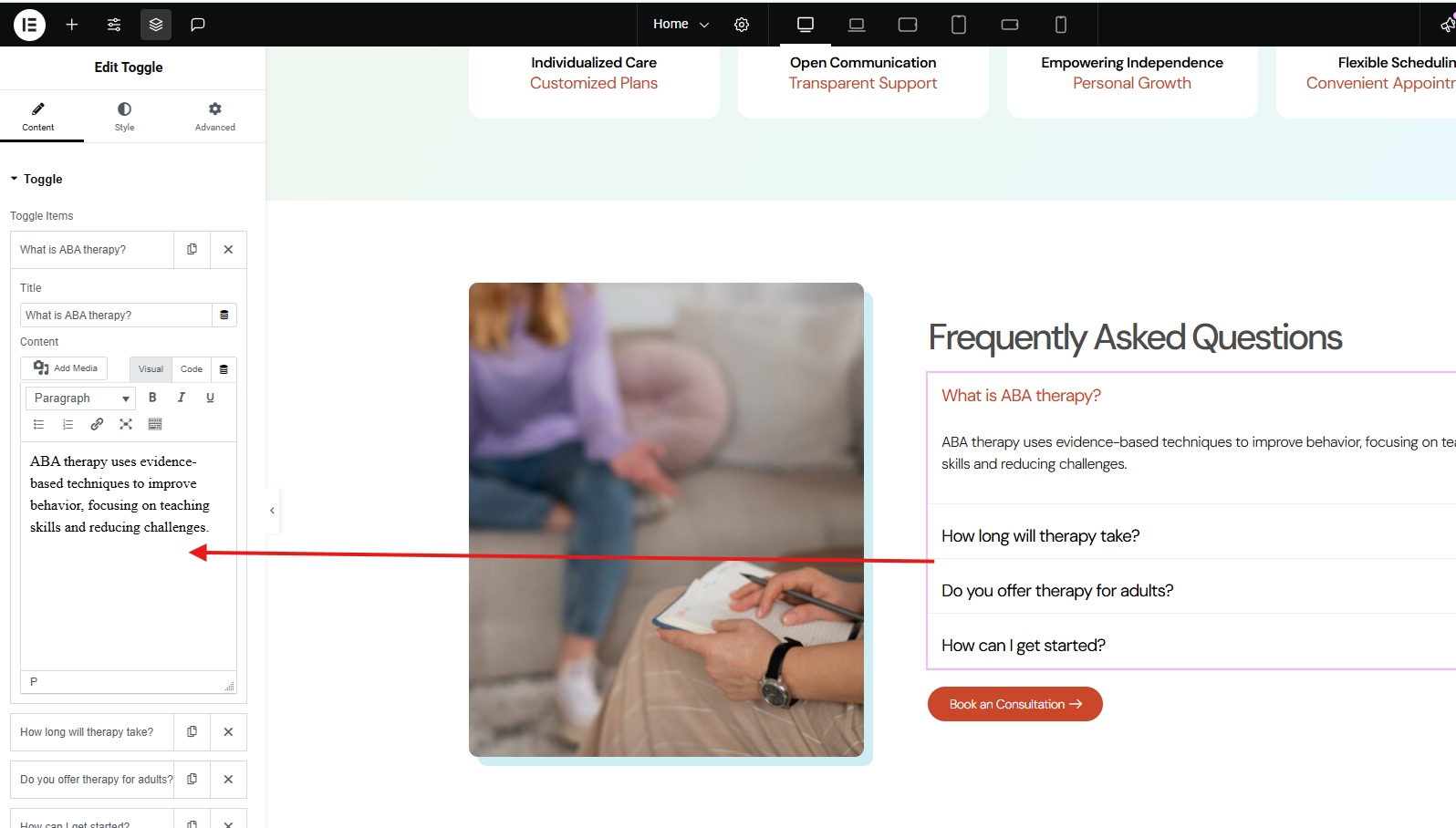
Step 19: Publishing and Updating Your Page
Once you have finished editing your page, it's time to save and make your changes live.
Preview Changes: Before you publish, you can click the Preview icon (the eye) to see how your page will look to visitors. This allows you to catch any last-minute issues.
Publish Button: When you are satisfied with your edits, click the green Publish button.
If this is the first time you are saving the page, the button will say Publish.
If the page is already live and you are making updates, the button will say Update.
After clicking, your changes are saved, and your new or updated page is now live on your website for everyone to see.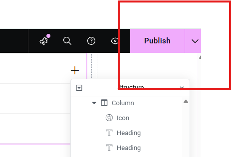
Step 20: Editing Forms
The Form widget is a crucial tool for collecting information from your visitors, whether it's for a contact page or a newsletter signup.
Select the Form Widget: Click on the form you want to edit. The editing panel will open on the left.
Content Tab: This is where you will manage the form fields and settings.
Form Fields: This section shows a list of the fields on your form. The image you provided shows fields for First Name, Last Name, Email, Phone, and Message.
Add Item: To add a new field, click the "+ Add Item" button. You can then choose the type of field (e.g., text, email, URL, radio buttons, etc.).
Editing Fields: Click on any existing field to expand its options. You can change the field's label, placeholder text, and set it as required.
Buttons: Customize the submit button's text and alignment.
Actions After Submit: This is a very important setting. You can configure what happens after a user submits the form, such as sending an email, redirecting to a "Thank You" page, or connecting to a marketing service.
Step 21: Styling Forms
The Style tab for the form widget gives you complete control over its visual appearance.
Form Fields: You can style all the input fields, including the text color, background color, and borders.
Button: As with a regular button widget, you can customize the submit button's typography, color, and hover effects.
Messages: Style the success or error messages that appear after a user submits the form.
Step 22: Advanced Form Settings
Just like with other widgets, the Advanced tab allows you to fine-tune the form's layout and add dynamic effects.
Layout: Adjust the form's spacing using Padding and Margin.
Motion Effects: Add animations to the form to make it more engaging.
Custom Code: Use Custom CSS for any unique styling needs.
Remember to click the green Update button to save your changes and make the form live on your website.

Step 22: Editing Social Icons
The Social Icons widget is a quick and easy way to link to your social media profiles.
Select the Social Icons Widget: Click on the social media icons on your page. This will open the editing panel on the left.
Content Tab: This is where you will add and manage your social links.
Social Icons: In this section, you'll see a list of your social icons.
To edit a social link, click on the item. You can then change the icon and paste the URL to your profile.
To add a new social icon, click the "+ Add Item" button at the bottom of the list.
Shape: You can change the overall shape of your icons (e.g., Circle, Square, Rounded) using this option.
Style Tab: This tab allows you to customize the look of the icons.
Color: You can choose an official color for each icon or set a custom color for all of them.
Size: Change the size and spacing of the icons.
Advanced Tab: As with other widgets, you can use the Advanced tab to adjust spacing and add motion effects.
